Client
Year
2022 to present
Category
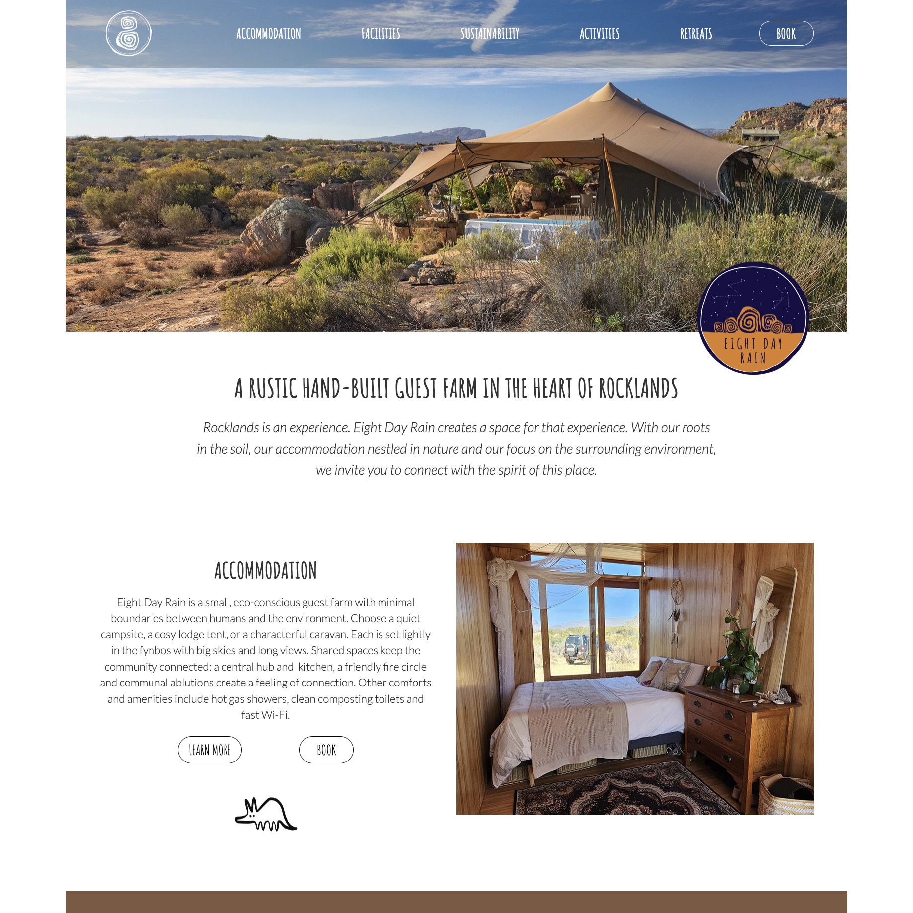
Brand Artwork, LogosEight Day Rain is rustic hand-built guest farm in Rocklands, in the Northern Cederberg, South Africa.
The farm is named for the bouldering area that is situated on it, which is so named because of the legendary eight day rains that sometimes occur in the Agter Pakhuys valley.
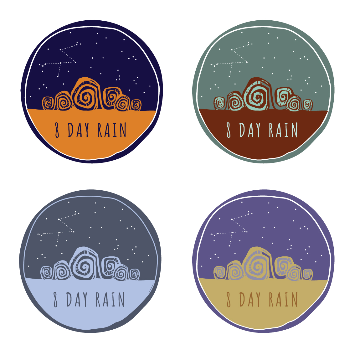
Their primary logo and brandmark uses the symbol of the “8” from the farm name, in an organic expression with a lino-cut feel. The feel for the logo and branding was inspired by the boulders and rock formations of the farm, Jethro’s love of board and fantasy games (think Tolkien fantasy map key or Magic, The Gathering card traits), and the rock art that is found extensively in caves and overhangs in the area.
The primary colours of orange and navy were drawn from the baked orange sandstone, and the inky night sky with sparkling stars.
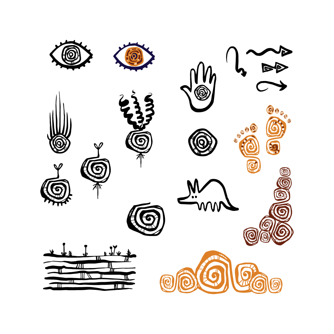
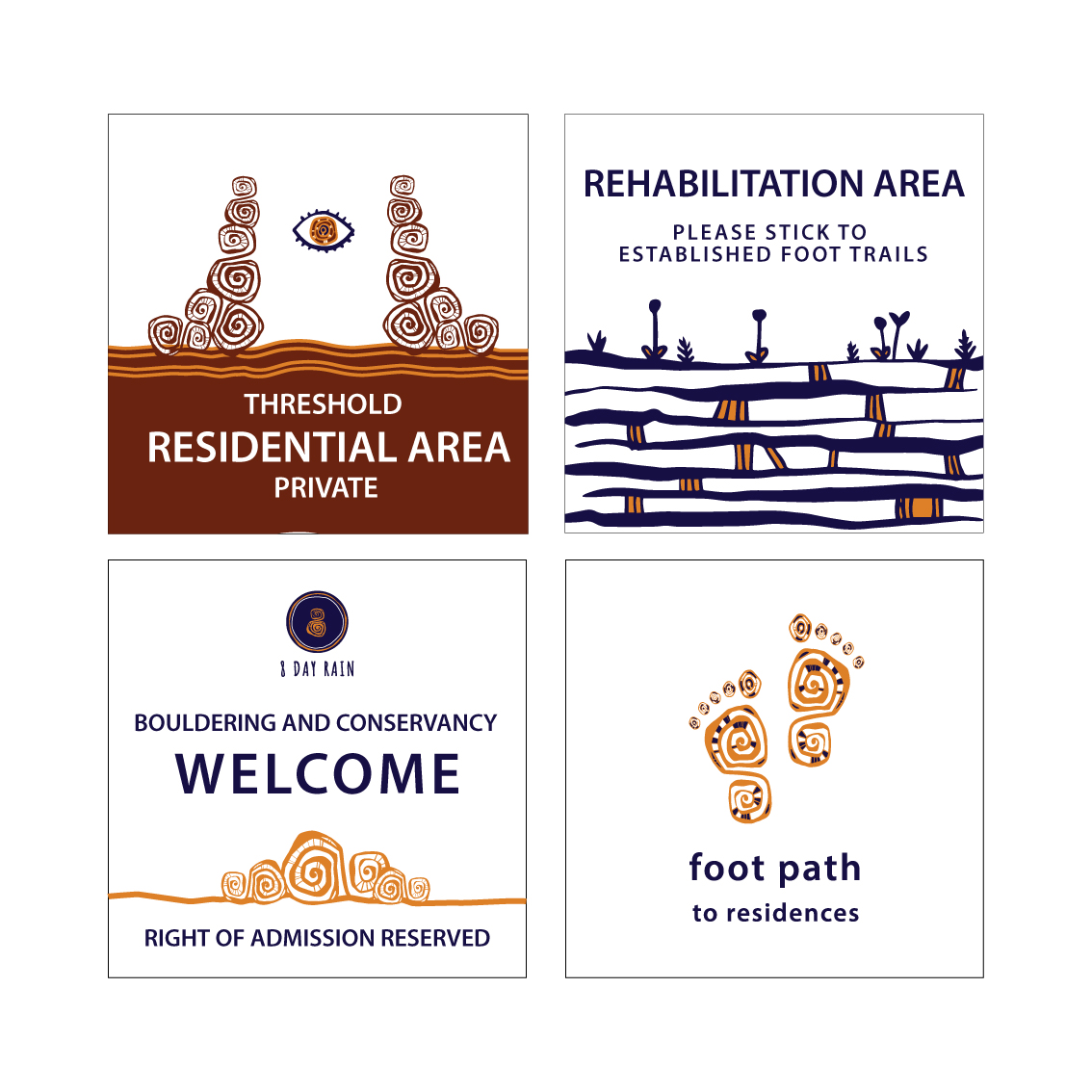
For their extended brand package we created a flexible visual language, based on the spirals and interconnecting lines found in the logo, that could be extrapolated into a variety of icons and visual elements. These elements are used in signage and visual communication on signage on the farm and in the landscape, as well as in their online presence (social media and website.)